re:birth
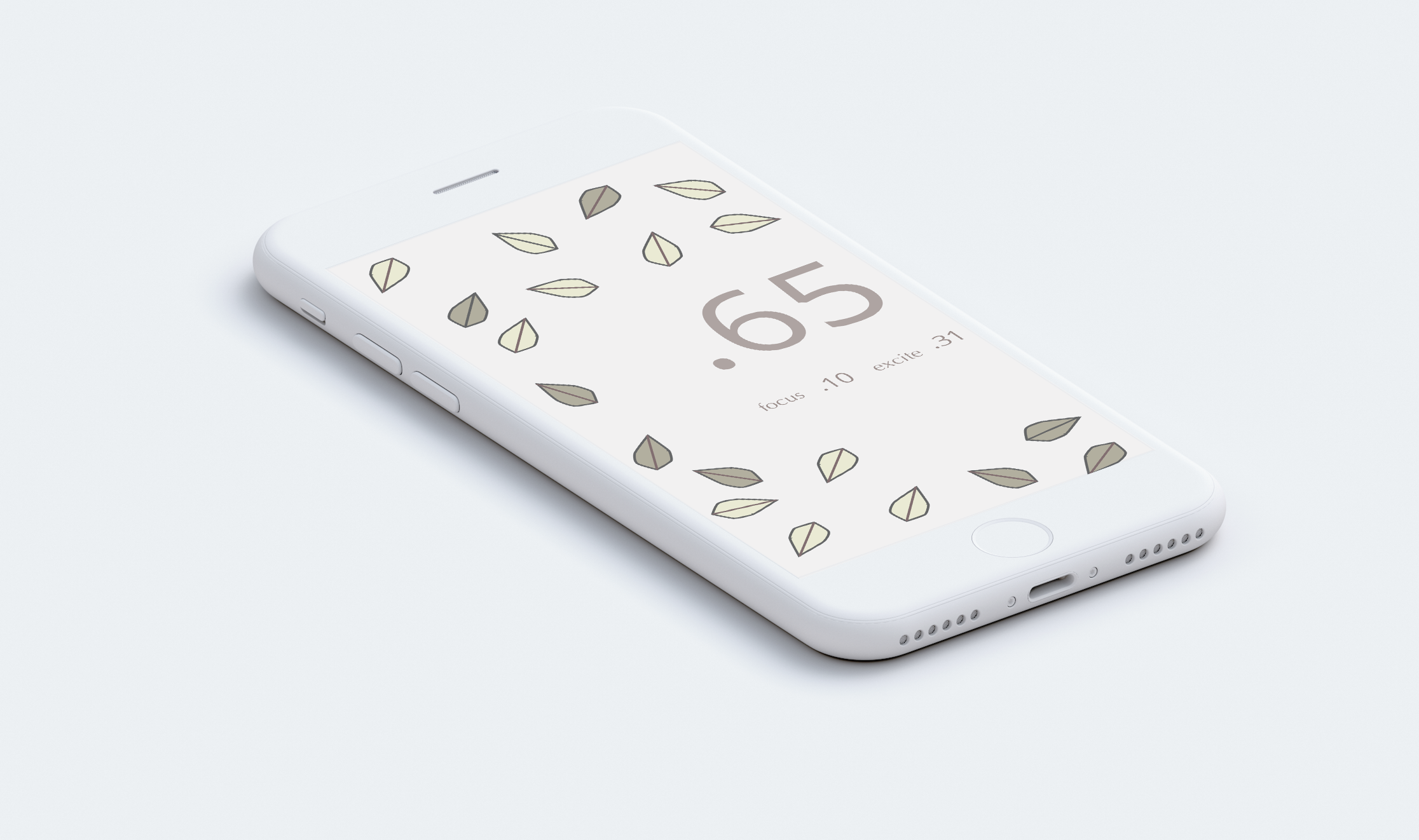
People who are stressed use stress wearables to track their stress, but many of these are seen as being kind of nerdy and are highly obvious. They don't attract people who aren't into tech or health. My mission was to design both a wearable and matching UI that would turn stress into something positive. Can you re:set your stress levels?
Through and through this was an iterative process of evaluating the project goals and whether the UI were meeting those goals. The process began with research and ideation.
Requirements/ Logistics
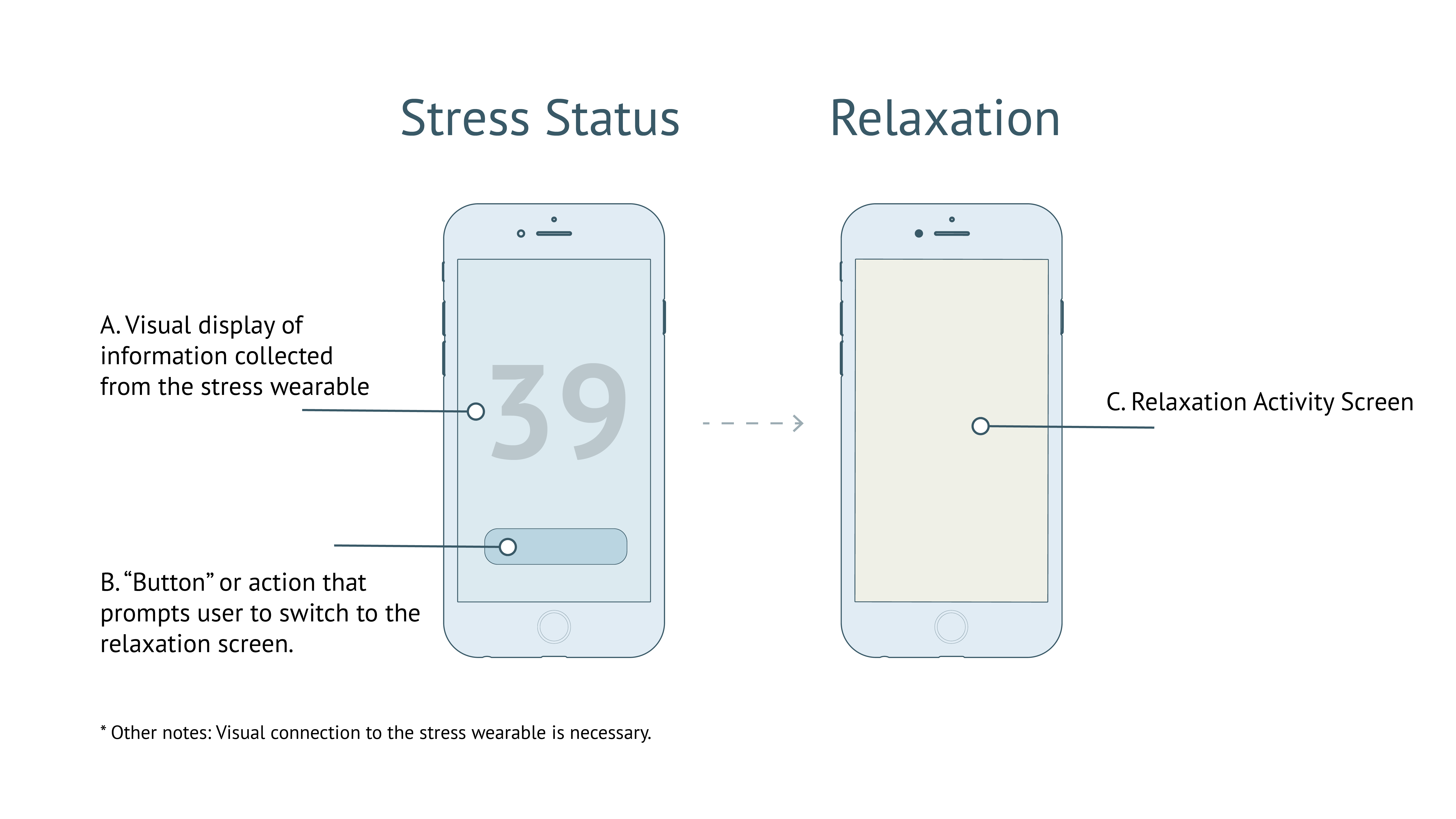
This was a four week iterative design process. Each design iteration was completed in a weeks time and critiqued by design instructors and fellow colleagues. Based off of feedback, the design was reworked. The app requirements are laid out below:
What makes you feel relaxed? (Brainstorming/ Mood Board)
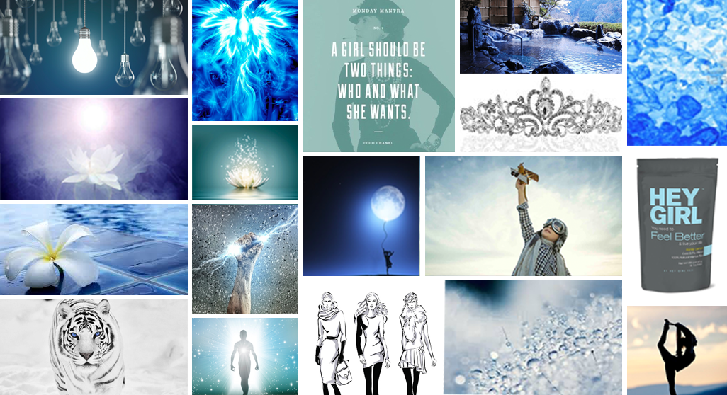
The first step was to gauge what might make people relax from stress.
Typically, we associated stress with heat (the color red) so the reverse would be thinking of cool temperatures. You can think of water droplets or ice as a way to cool down. However, water has another connotation - revival. You can think of someone jumping out of the water and being revived or you can think of an ice phoenix having its rebirth.
What if instead of telling someone to take a breather you helped them persevere towards their dreams?
Girls who are stressed don't always need to be told to cool down. Sometimes you're stressed because you might be so swamped up in your work that you forget your real goal. You forget that you can do it. You can do it. Being told you need to take deep breaths won't make you feel more calm but more stressed because now you're stressed because you're being told you're stressed and you need to calm down but now you're more stressed because you can't take calm breaths! (I get stressed out just reading that sentence). Instead we want to focus on our real goals.
Revised Goals
- The wearer should feel powerful wearing the crown.
- The matching app should remind her she is powerful.
- The app needs to monitor stress.
- Help her focus on what really matters.
A Golden Crown of Leaves for the Queen
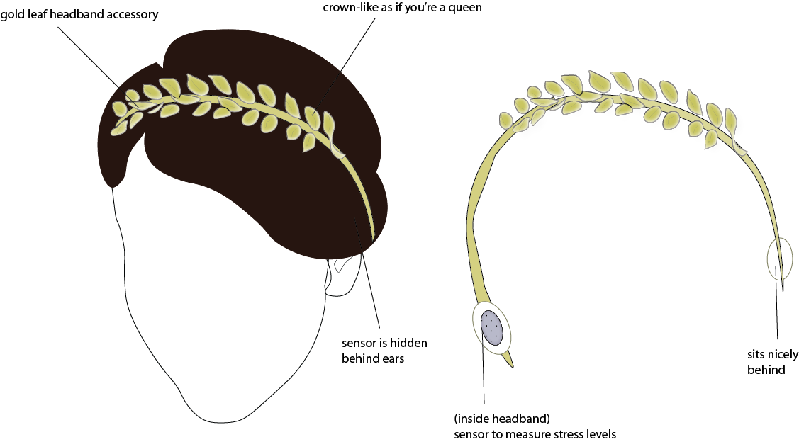
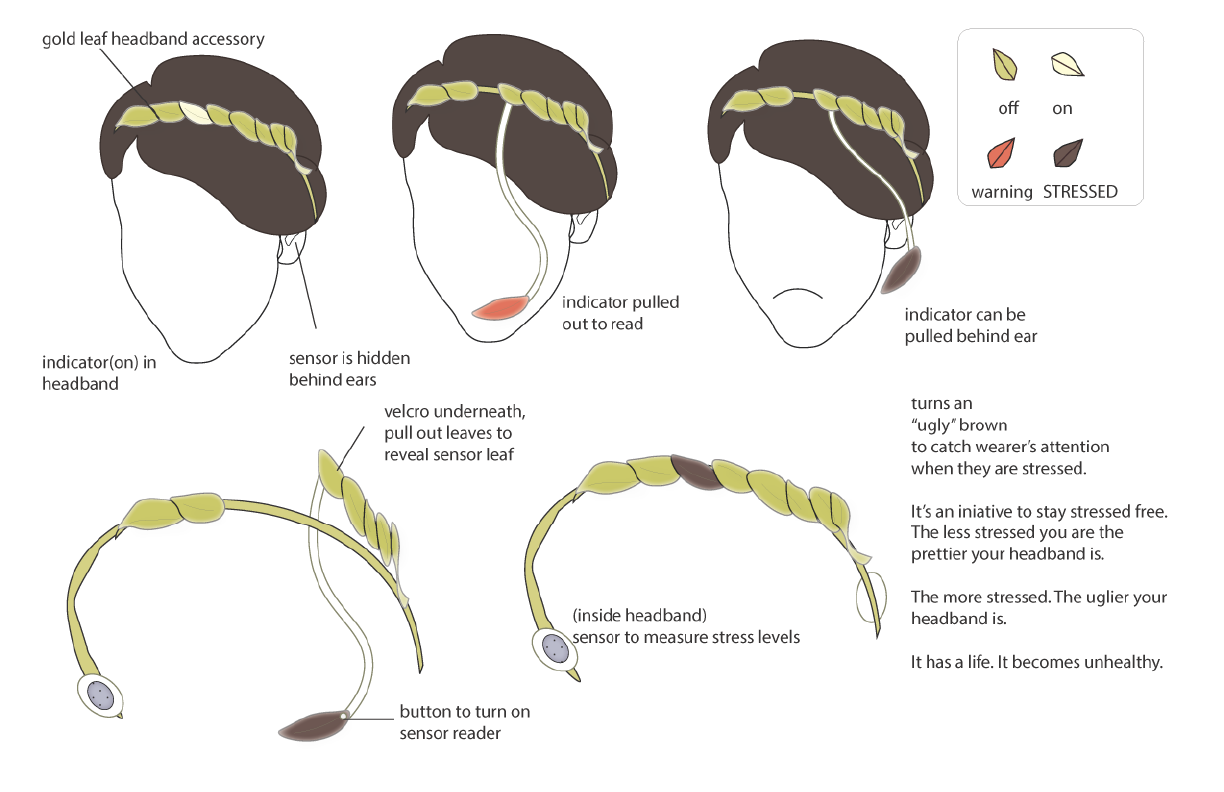
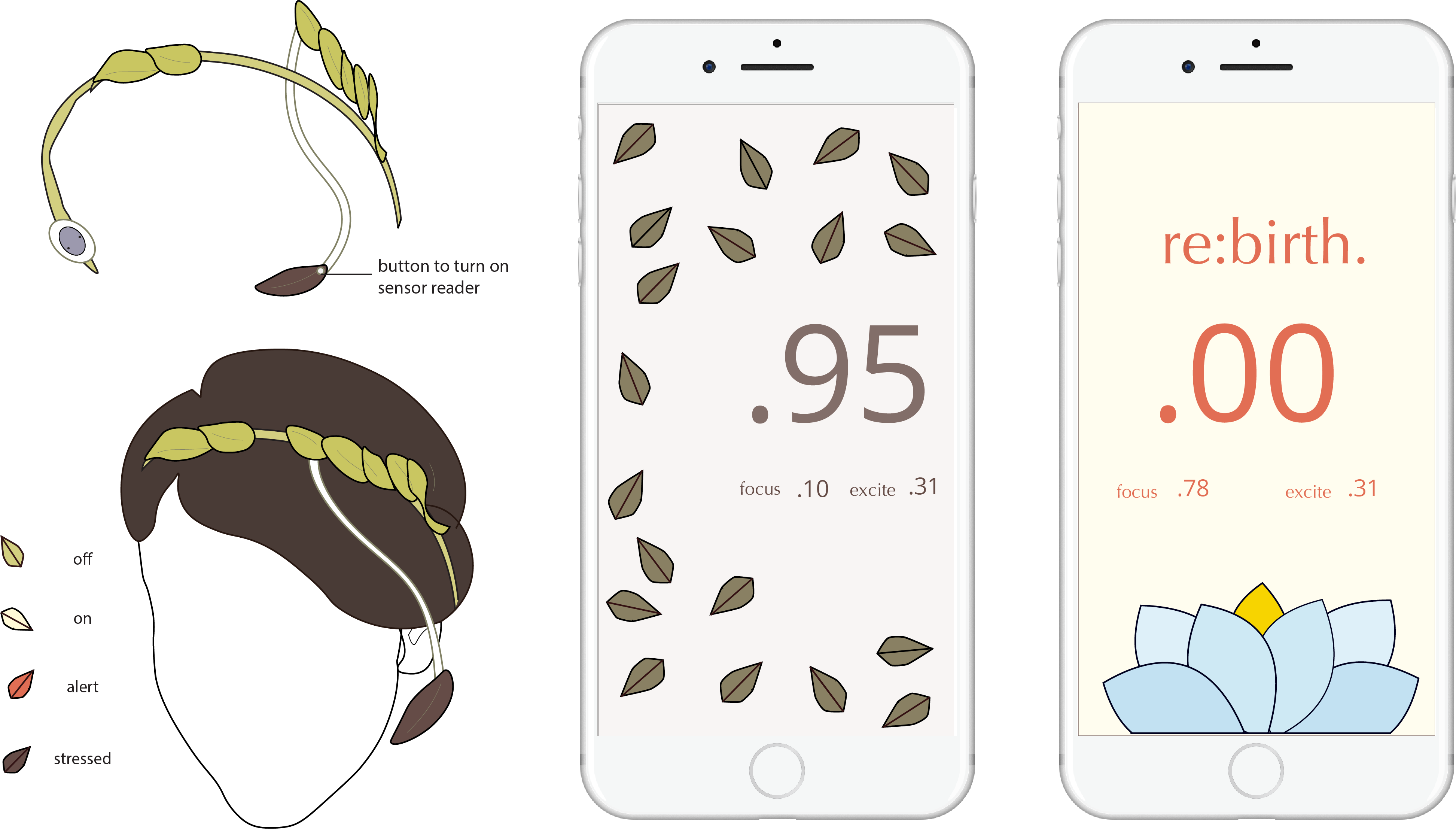
The initial idea was for the wearable to look like a golden leaf headband. It would be like a crown, so that the wearer feels like queen (and fashionable) when she wears it. It's also not that obvious it's a wearable to track stress. The stress sensor is hidden behind her ear and is encased within the headband. The main issue with the initial wearable sketch is that there is no visual indicator of how you're stressed. She would have to look at her phone or in the mirror and if she's in the zone, the stress sensor could be going off for hours and she would never know! The final wearable is has a detachable "sensor leaf" that changes colors to indicate stress.
The Revised Crown with a Magic Sensing Leaf
Font Study
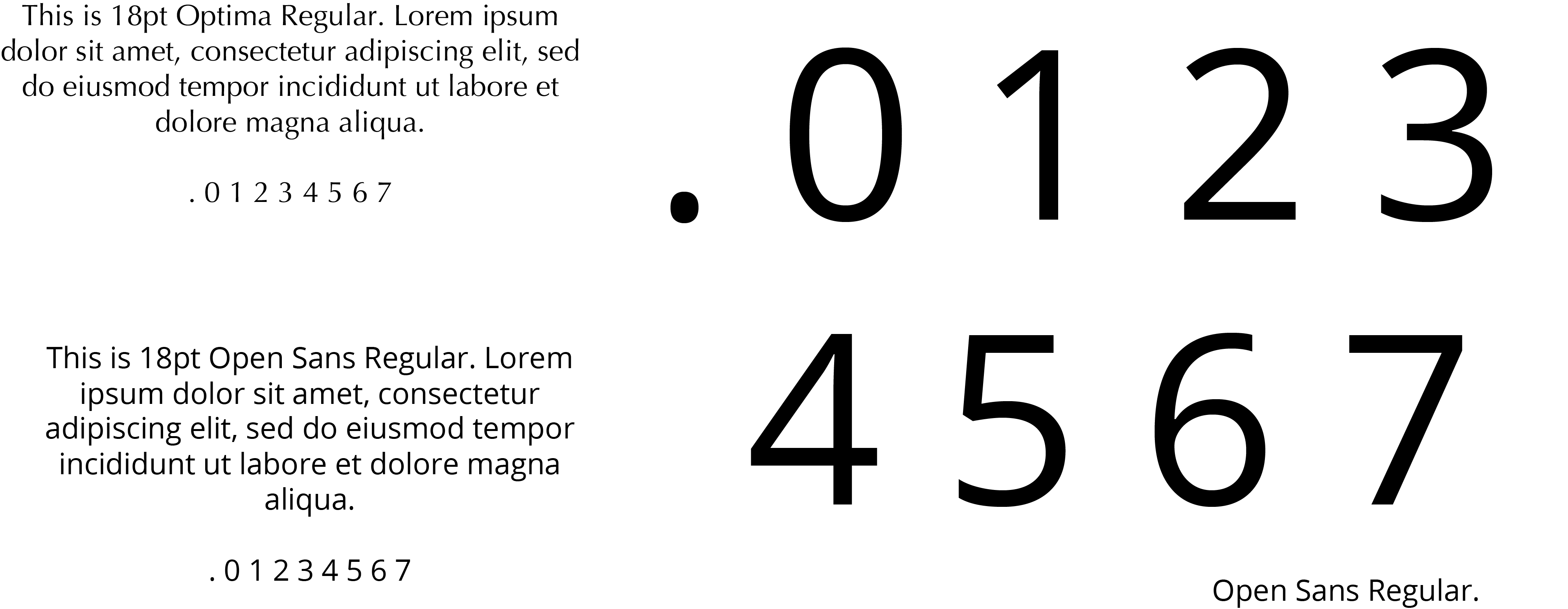
Two different typefaces are used on the numbers along with two different sizes. Readability was an important factor in chosing a typeface, but the text was also chosen to set the aesthetic tone for the piece because there is little text. Only one type of text-typeface is used in the piece because only one type of information is conveyed through the text.
Original Color Pallete
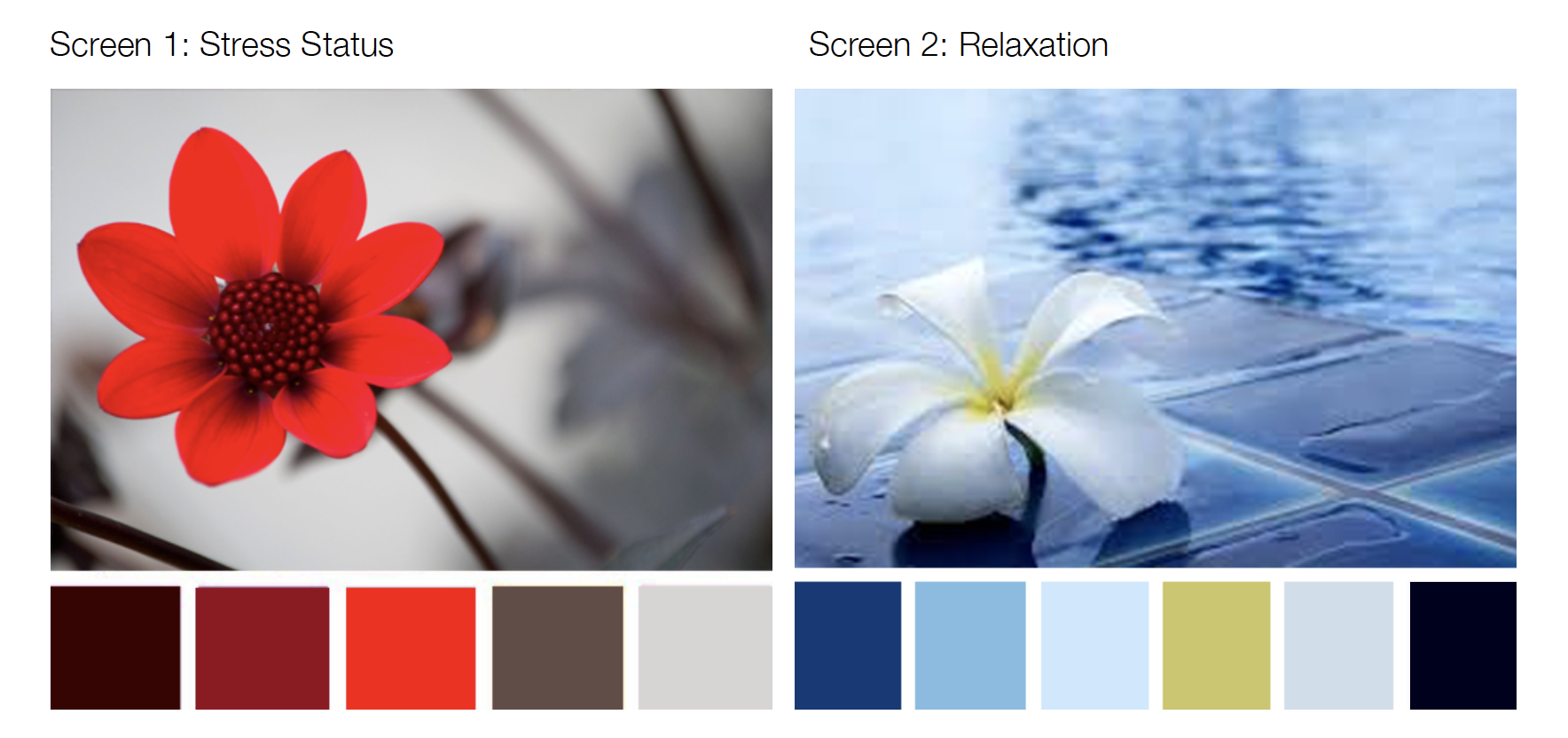
My original color palette was inspired by colors I associate with temperature. Relaxing colors are related to cool colors like blue while stress is connected with colors like red because of heat. Colors were initially pulled from these flower images, one red and one blue.
Final Color Pallete

My final color palette deviated from the red/blue association for heat as I began to pull in elements of dark and light. A full red screen with red elements and a full blue screen with blue elements did not have enough contrast. I chose colors that were more respective of the iconography of the leaves and the final flower. The final flower is blue which is reminiscent of the original temperature inspired palette.
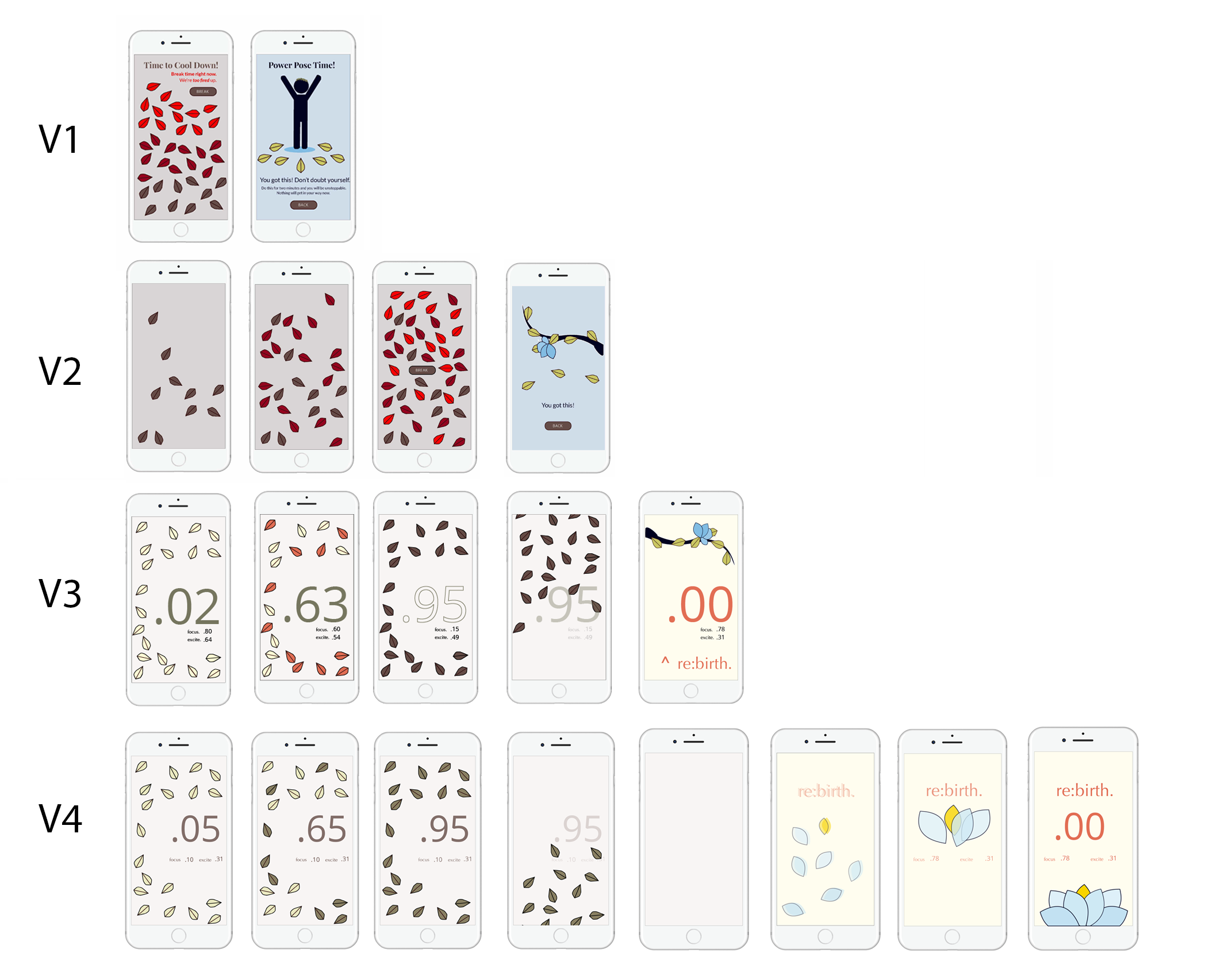
An Iterative Process of Re-doing and Adding Screens.

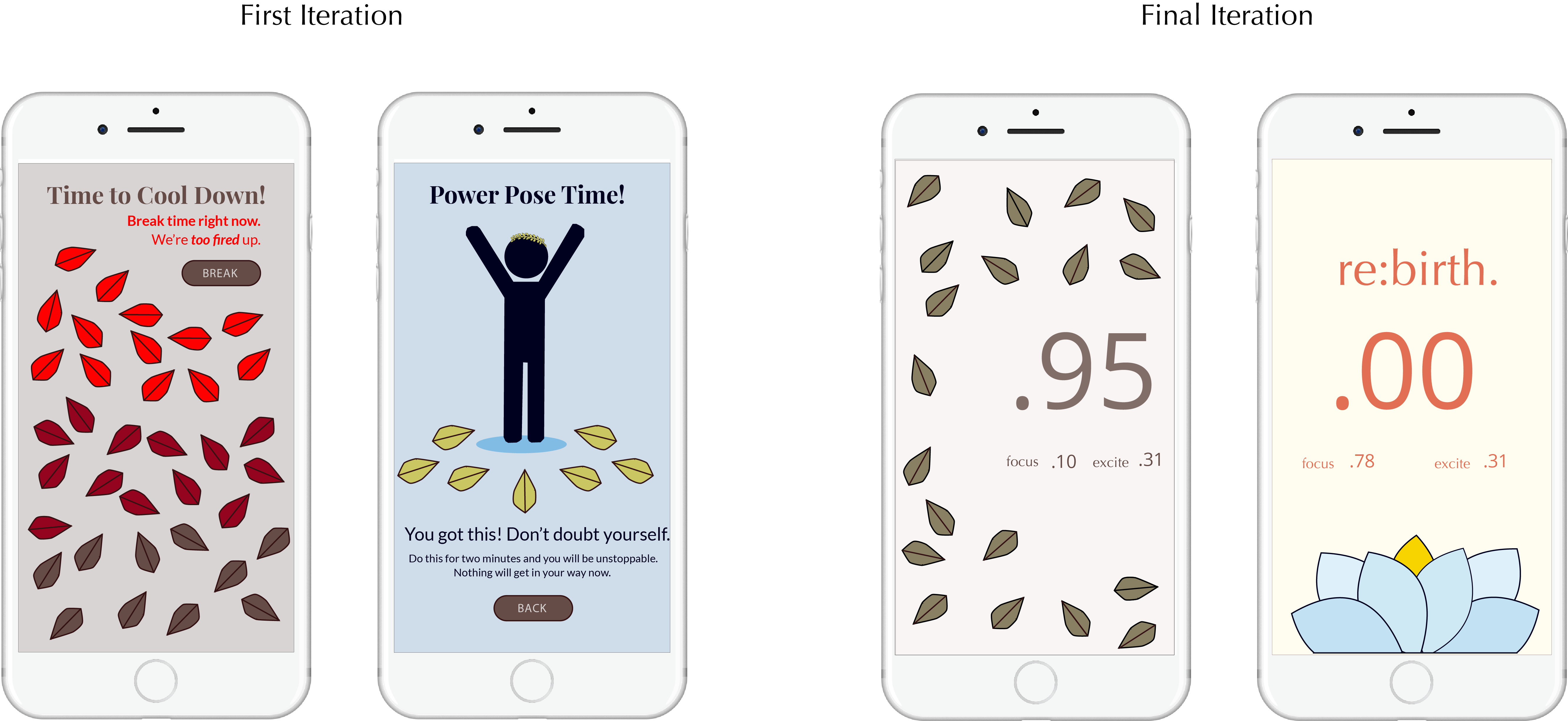
Throughout the process, I found that adding more in-between screens created a more coherent narrative. The final screen may have changed quite a bit and the only icon that has remained throughout are the leaves. However, the goal of empowering women has not changed. It has been a process of creating and using imagery that would best tell the narrative along with placing elements where they would be best.
Problems with Early Iterations
Version 1
- The initial idea was that the leaves were like a thermometer, but this left the leaves looking too organized when they suggested otherwise.
- Too much text (telling the user to do things that should be intuitive and strange words of encouragement)
- Strange Imagery (It looks like the person is jumping on leaves when I wanted a "ta-da" effect)
- It was suggested that I try building a tree with the leaves.
- The screen when the user is not stressed looked more dreary than when they are stressed (the screen looked too empty)
- I went from too much text to too little text. I was then challenged to introduce meaningful text and to try to make it big or in the middle.
- There are also two different color worlds - the gray and the blue.
- This design used a grid system to organize the content and I changed the colors which represented more of a light/dark instead of hot red/ cool blue.
- The biggest problem is that there are too many systems - withering leaves, sweeping leaves, ground/down.
- It's unclear how you pan up from the group ("two different views still - world of the leaves on the group and world of the branch").
- The story telling is a little weird because you have all of these fallen and withered leaves, but they somehow return to the branch.
It could work, but it can still be fixed.
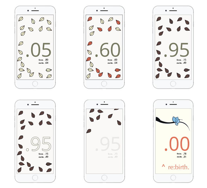
Since, the beginning of the project, I had these fallen leaves that were spread on the ground. The stressed screen was an indicator of stress, but I also saw it as a wallpaper. It's not too intrusive that it distracts you and if someone passed by they might think something like, "oh this girl has a nice graphical wallpaper." It has some wallpaper like qualities.
One of the biggest issues with this iteration is that there is a bit of a disconnect between the stress screen and the relaxed screen. There are two different worlds, the world of the fallen leaves and the world of the tree branch with the abstract blue flower. While I saw this as two views, one as looking down and then when you relax, you can look up. There isn't a strong transitional cue as to why we're looking up a tree. How did we get there? And why are there green leaves on this tree?
One of the biggest issues with this iteration is that there is a bit of a disconnect between the stress screen and the relaxed screen. There are two different worlds, the world of the fallen leaves and the world of the tree branch with the abstract blue flower. While I saw this as two views, one as looking down and then when you relax, you can look up. There isn't a strong transitional cue as to why we're looking up a tree. How did we get there? And why are there green leaves on this tree?
The Wearable and UI Together
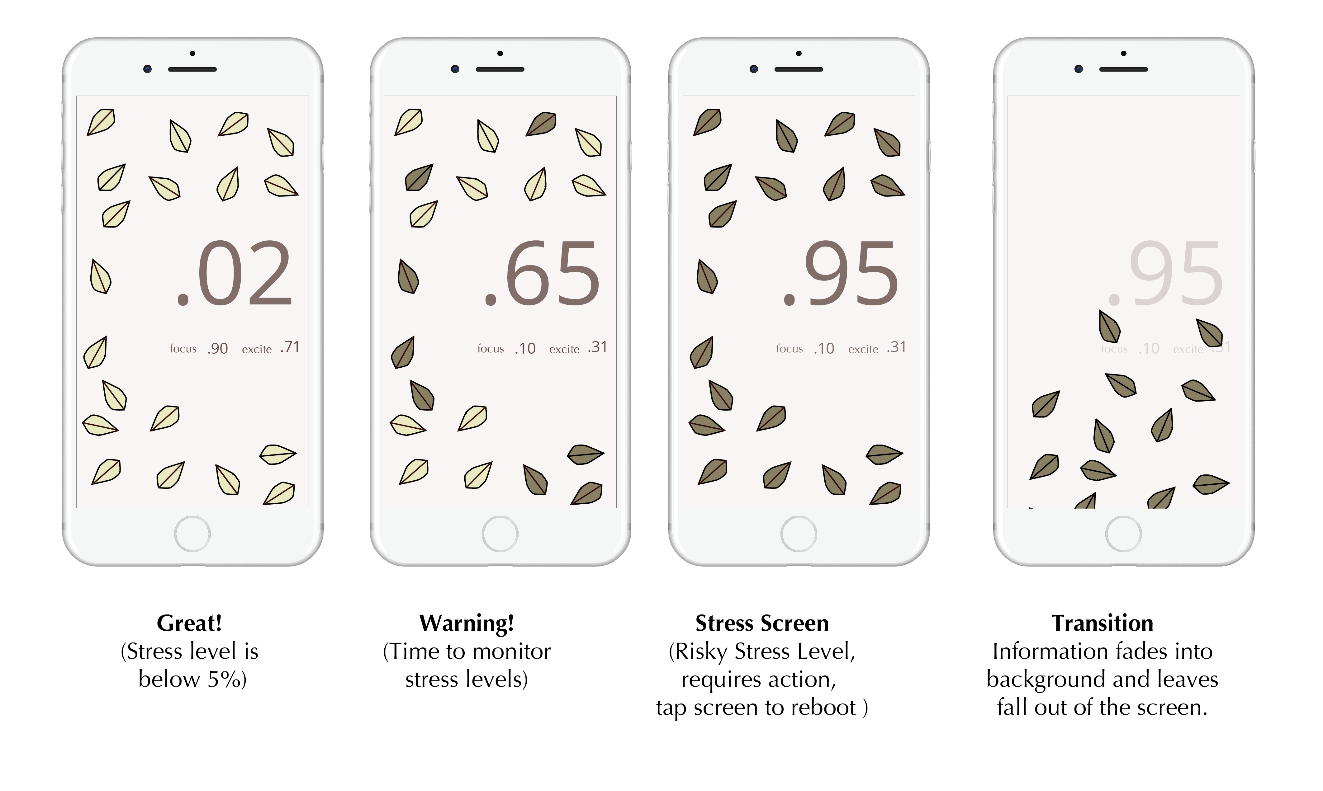
Sweep Away Your Stress and Be Reborn (Screen Transitions)
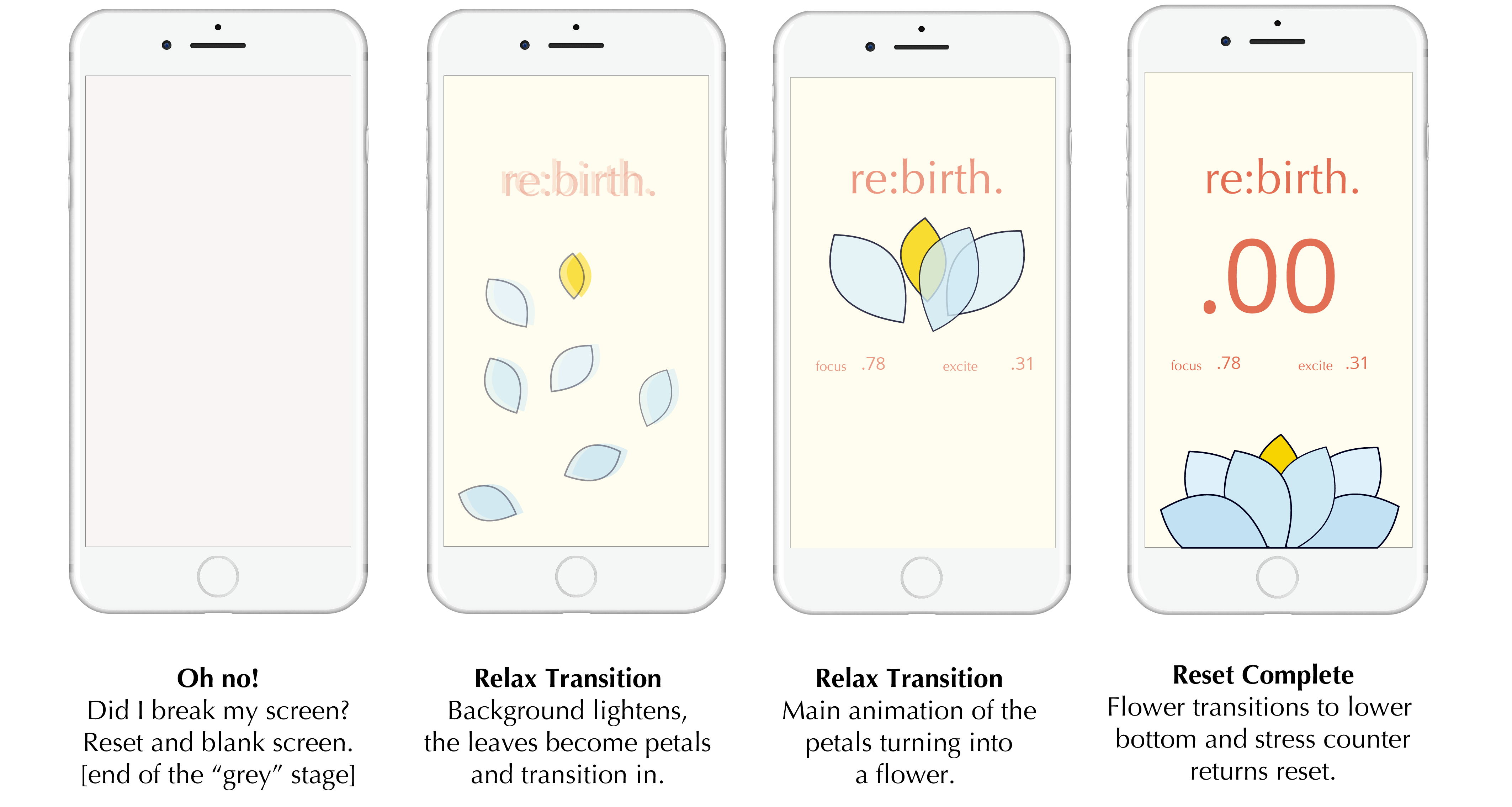
Main Takeaways
This project taught me a lot about how to carry through and develop a concept. Since the beginning I had this idea of a leafy headband and leaves spread out on the stress-screen. I wanted to the leaves to be decorative but also a monitor and I wanted there to be a strong connection between the leaf headband and the app.
I wanted this app to turn stress into something empowering. I originally thought of power poses that induce high power. And in my first screens iterations I had a set of instructions for the user to strike a power pose and a way to stretch and refresh.
However, I ended up playing with the idea of the leaves and the narrative that could be built up with that. I discovered I was able to to convey the same message without being as literal. The goal of the app isn't to do a power pose, but for the user to be refreshed and revived.
.