How Far From Comfort?
An epw file compatible web-based data visualization tool of how comfortable a climate is. (link)
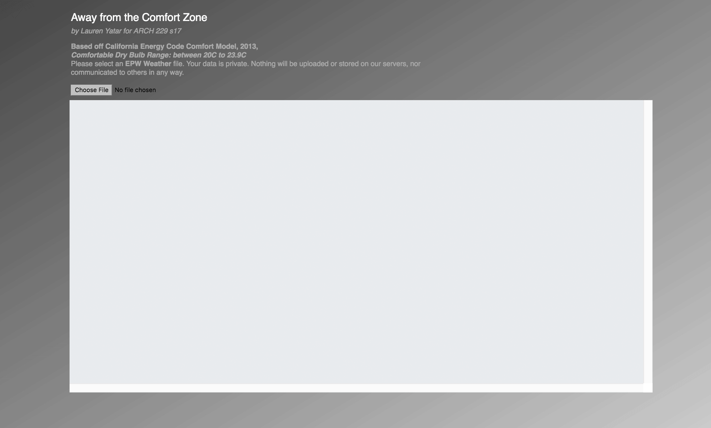
Based on California Energy Code Comfort Model, 2013, Fullerton, Fullerton Municipal Airport
Comfortable Dry Bulb Range: between 20C to 23.9C
Note: It may take a couple of seconds to load.
Background & Objectives
Architects and building scientists use climate data to inform their design decisions but many of the current visualizations are difficult to understand. For this project, I aimed to do three things:
- Make it easier for architects to understand what the climate is like.
- Challenge Conventional Climate Visualizations
- Create an interactive tool.
This tool is aimed at architecture and building science students who are already familiar with epw files and have a basic understanding of building science, energy, and the environment.
Project Scope
The total timeline for this project was 10 weeks which includes research, exploration, iteration and prototyping. Prototyping in d3.js lasted about 4 weeks. A general d3 template was set by the instructor and the dy library was used to parse epw information. Styling and interactions in these examples were completed by me.
What information do the users need?
How comfortable is this climate?
The most common way to use climate data is to find out when a climate is comfortable. The epw file contains a lot of information so it was important to find a way filter the information for only what we need to know. This visualization only takes one value (dry bulb temperature), but in the future, it would be easy to swap the value for a different input.
This graphs requires two pieces of information:
- Value from epw file(dry bulb temp, dew point temp, rel humidity, etc.)
- Formula (in this case comfort is a range (i.e., low < x < high))
The visualization is embedded at the top of the page. A link to the version where the user can upload an epw version is available here. Keep in mind that blue is below the comfort range (too cold) and red is above the comfort range (too hot).
Why do we need new tools?
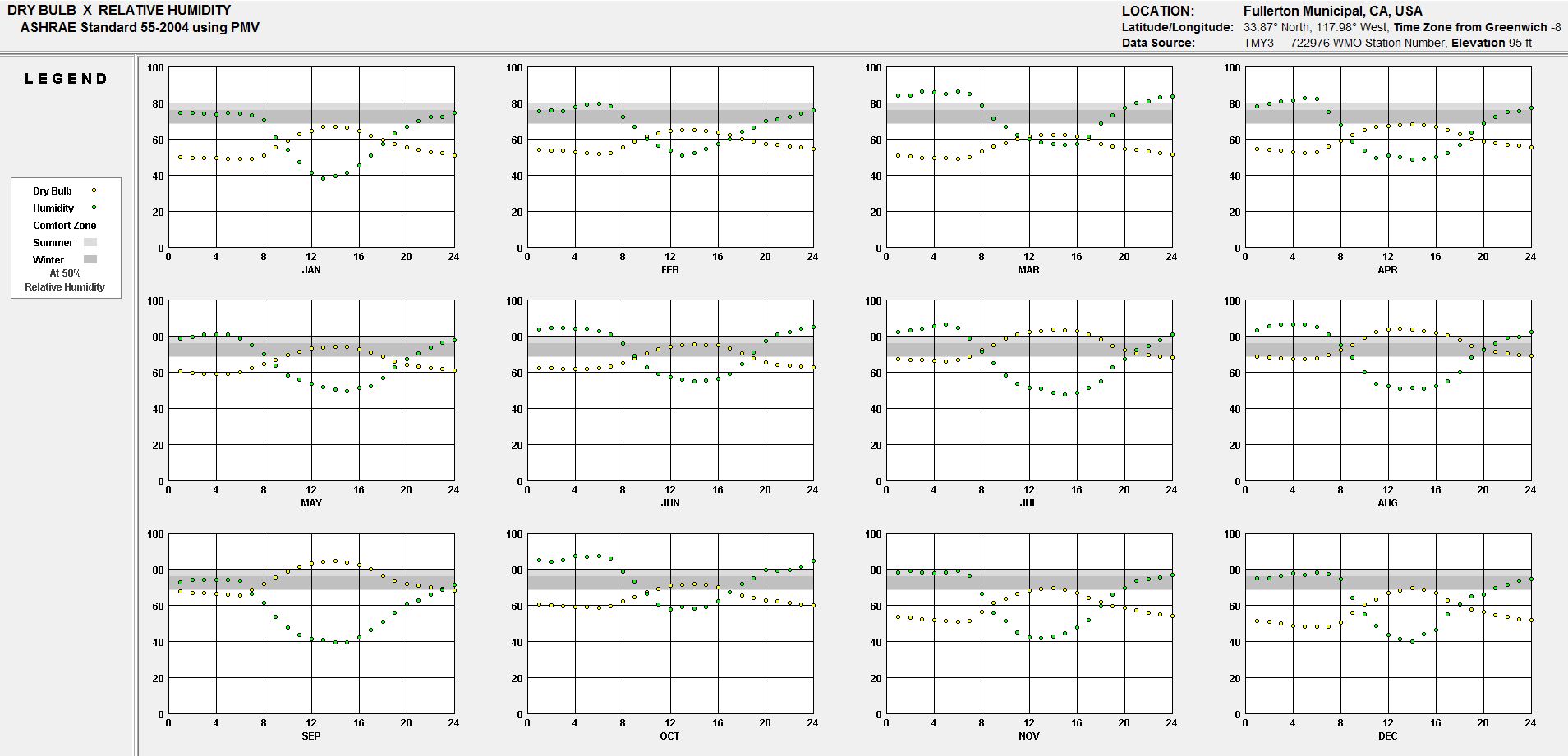
Many of the charts used to interpret climate data are very hard to use.
Looking at this chart from Climate Consultant (below), we see an overlay of dry bulb temperature, relative humidity, and the comfort standard. While you can see the general trend and compare how each looks different month to month, the problem is that you can't see the exact numbers or pieces of information that are on the page.
Other common methods are using CAD software plugin combinations such as Grasshopper, Ladybug, Honeybee, and DIVA alongside Rhino 3D (which requires time to learn). Of course, you could use a spreadsheet or python to do parse the epw information and graph (which I tried), but that requires programming. A common architecture student is not likely to have programming knowledge. A building science student may if they came from a technical background like mechanical engineering, but hard-coding a program would take away their time to actually analyze the data and make something.
Product Definition Statement
To create a visualization that shows how many degrees we're away from the comfort zone given a specific time for a location.
Graph Overlays & The Design Process
To gain a better sense of what climate graphing programs were already doing and to see what types of information was essential, I went through a couple of exercises of adding overlays to Climate Consultant.
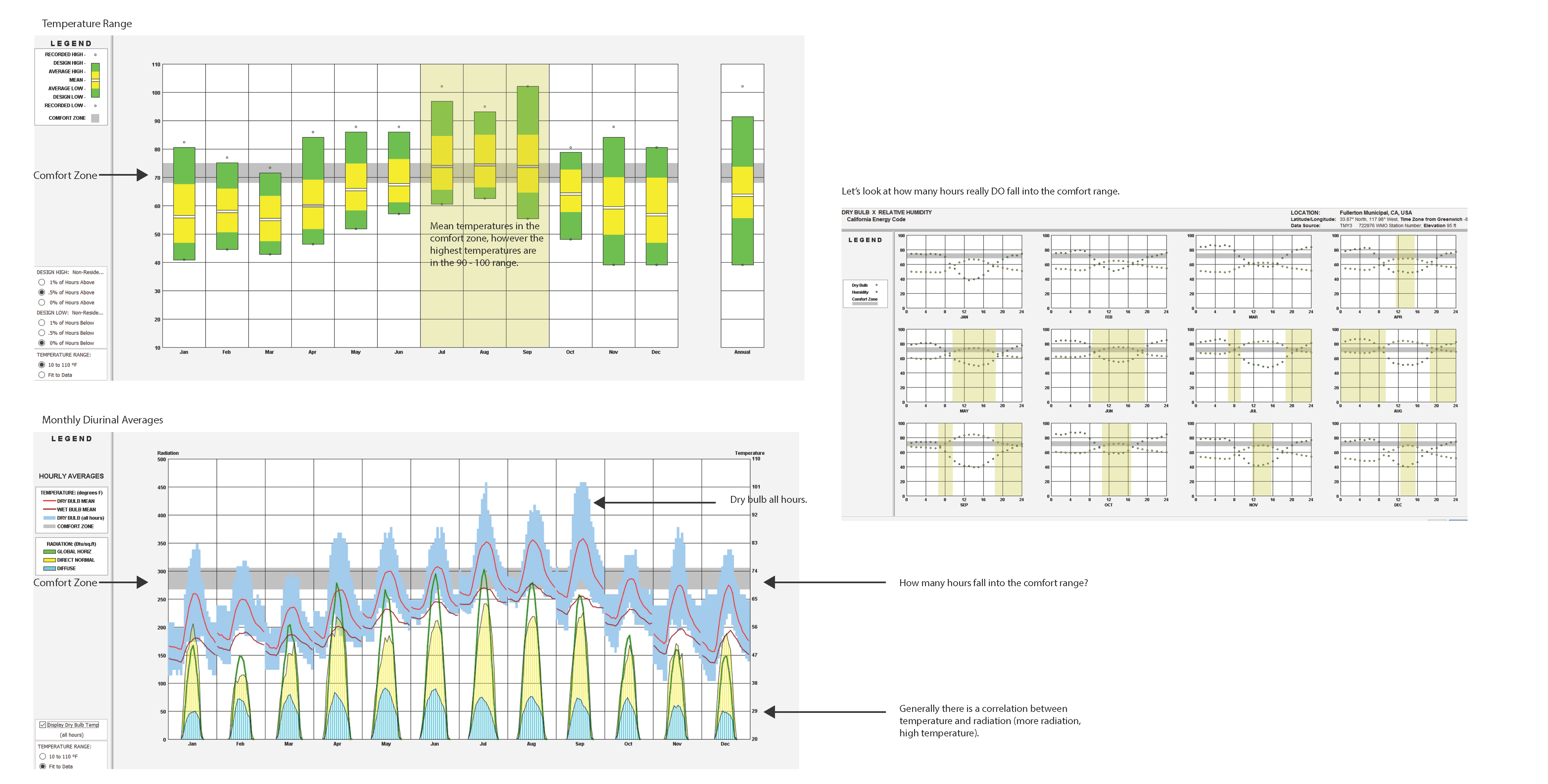
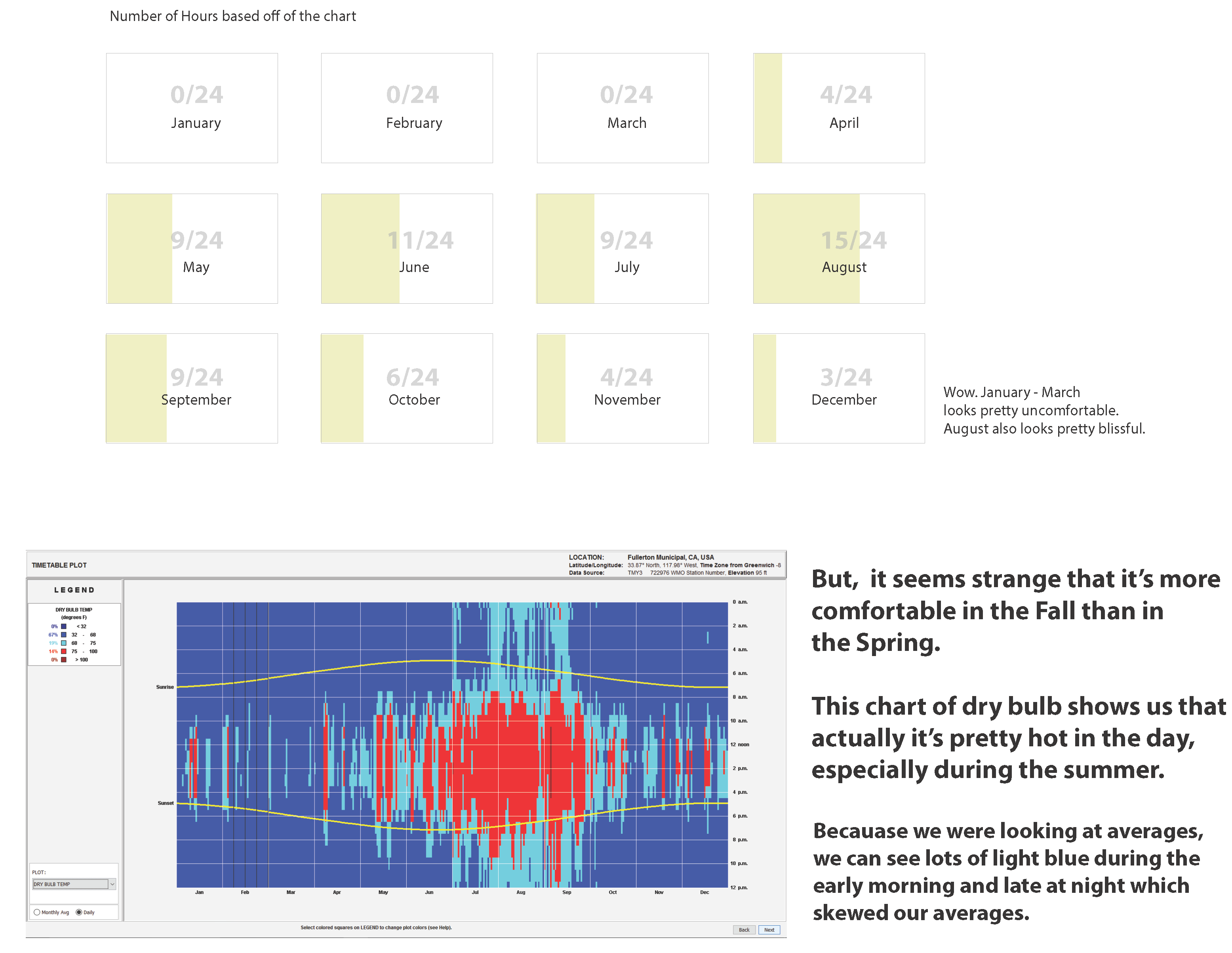
HOWEVER, a big issue of only counting the number of comfortable hours was that you can't tell when it's too hot or too cold. There's another set of information you're missing and you can't correctly describe using this method.
Therefore, I wanted to find a mechanism that would tell us:- When it's not comfortable
- When it's too hot or too cold
- By how much
Python, Excel, Illustrator, and D3
Before directly working with d3, I worked on manipulating epw data in python and used excel to plot the data. I took that data and then visualized statistically how it might look. I decided to flip the bar chart horizontally because you can't compare the hours vertically when the months are laid out horizontally. The horizontal bar chart is not a preset in d3 (d3 also doesn't like graphing negative values), so it was important to visualize the graph using other methods first.
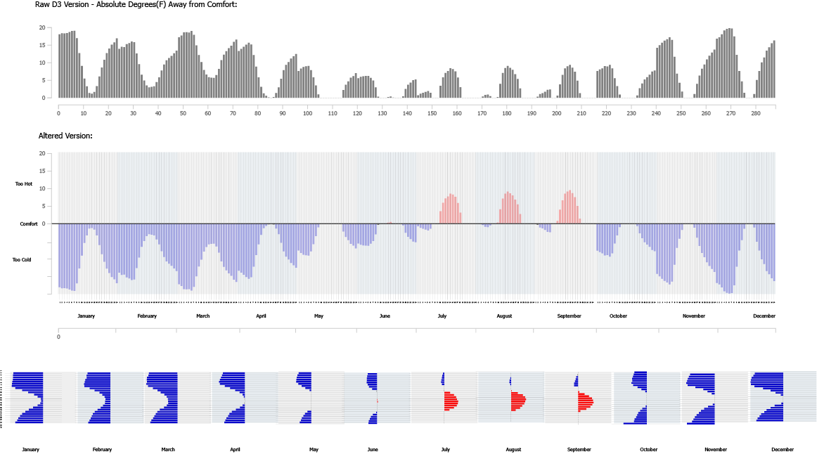
Positve Negative Bar Chart
The horizontal bar chart was a winner because:
- You can compare hours looking horizontally.
- You can easily see when it's too hot versus too cold (right vs left)
- You can see hourly trends in a month (during the summer it's too hot during the day, early morning/ late night is very cold, etc.)
- If you see more ink, you know to pay more attention to those times. If you don't see anything, it's comfortable so you don't have to worry about it.
Lessons in Interaction Design
Interactivity can be a lot of fun, but it should add more information or help tell you tell your story.
This is one of my earliest examples (this is Fullerton in July) where I experimented with interactivity and learned that it did nothing but add bling. There are a lot of "extra" features that don't help tell the story. Hovering over the numbers they bounce. If you can skillfully hover over a number long enough it will move to the center so you can more easily see the away from comfort value next to its corresponding bar
Early Iteration
The basic concept is that it would be an online tool where an epw file for the user's desired city would be uploaded and a graph would be displayed showing the climate data. The bar graph on the side indicates how many degrees away from the comfort zone. Each bar represents the average temperature for an hour monthly (for example, all of the 8am temperatures of January are sum in the January 8am bar) that is applied to the comfort formula. Light blue indicates it's too cold and red indicates it's too hot. The line graph to the right of the graph is a graph of the original average temperatures. When the user hovers an a bar, a tooltip provides more exact information about how far from comfort, the exact temperature average, and information about what the comfort scale is. When the user clicks on the graph, it reveals the dew point temperature (the green graphs) instead of the dry bulb temperature.
Missing Parts of the Story
Even if this polished iteration was clean and simple, it wasn't clear how comfortable it was day to day and comparing across hours was difficult.
I lost the horizontal scroll feature from my earlier sketch that made it easy to compare against the same hours. I went back to the drawing board to have a more holist view of the dry bulb temperature for the climate. The tooltip was helpful for showing more information, but perhaps I could try to work with gradients to help better decipher the value differences?
How to Read the Latest Iteration
What is the temperature like everyday versus to when you compare it to monthly?
Example 1
Fullerton, California; January - March
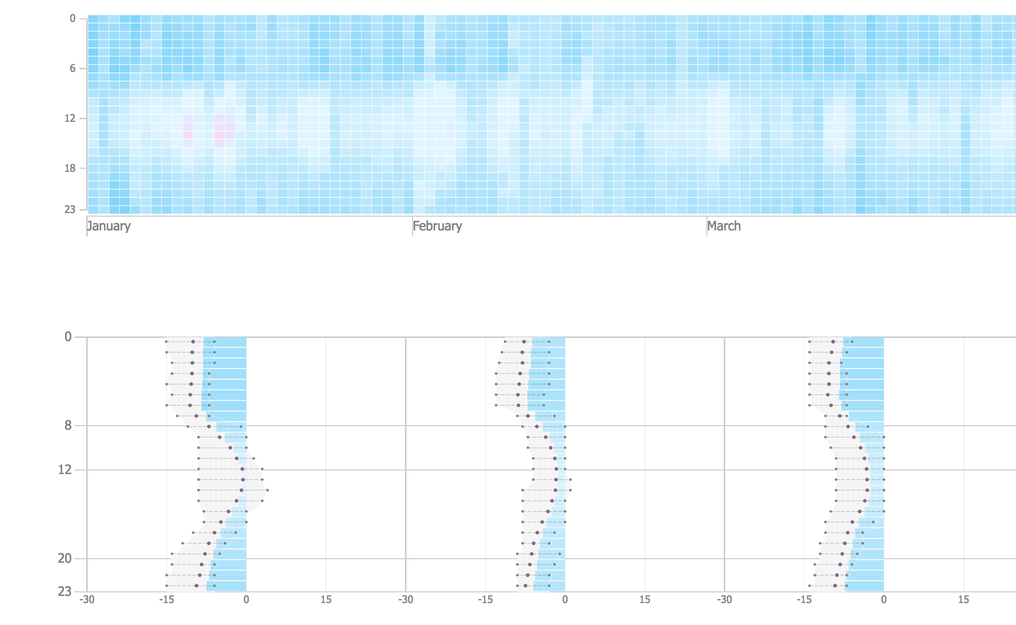
The top is a heat map where you can see the temperature for each day. The more vibrant colors you see the more extreme temperatures. The bottom is a bar graph inverted its side denoting how far away the monthly average is away from comfort. The longer the bar, the more away from comfort. The side line plot indicates the high and lows and the light gray shading indicates the average temperature ranges calculated under the comfort function to see how faraway that temp really is from comfort.
Example 2
Phoenix, Arizona; April - June
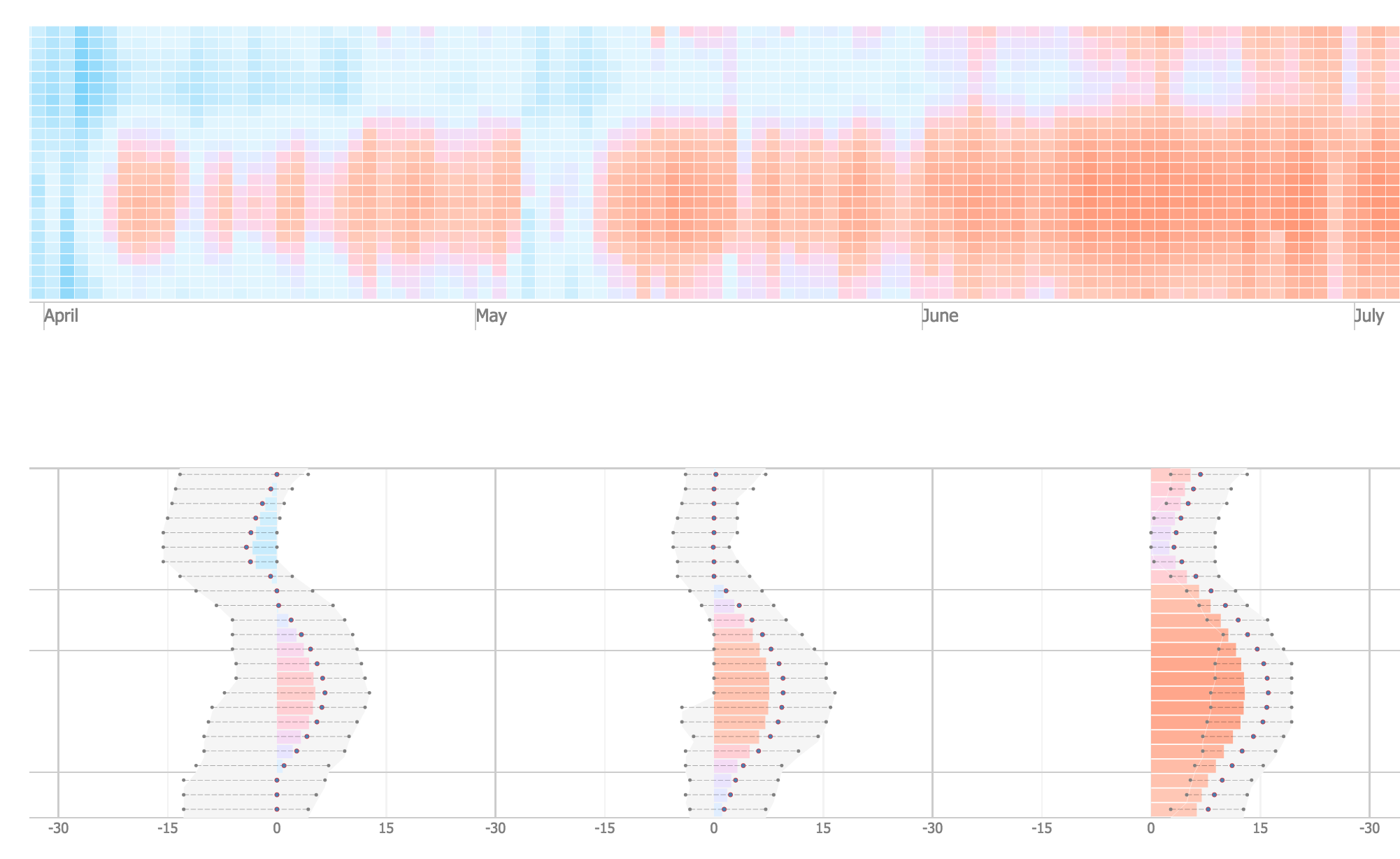
Phoenix has some of the hottest temperatures. As you can see there is more red, especially during the day. But during the morning and night in may we can see that its cool and can even be below the comfortable temperature.
Further Ways to Improve Visualization
This is a very early and exploratory attempt to look at d3 and climate data. For this to be more of a tool requires more advanced front-end development (the seminar was for architecture and building science students with some programming (javascript was not required)) which was out of the scope of this 2 unit seminar. However, within the scope some ways to improve the prototype would be to add:
- Ability to set conditions (asking the user what they would like to set comfort as, letting them add equations, etc)
- More variables (humidity, wind speed, etc.)
- Clearer articulation of what data is being shown (better annotation of the axes and consistency)
- Adjust Scale (The scale goes from -30 to 30, but many places can be more than -30C from the comfort zone (Alaska), but for a place to be 54C (30C above 24C) is very concerning and unlikely).
- Ability to turn on and turn on functions (Are we showing too much at one time? Do I really want to see max and min ranges?)
- Ability to see more than one climate (you can load multiple epw files and they will display, but it is very heavy on the browser and svg canvas size must be adjusted)
- Gradient Color (the color of a comfortable square is a very very light blue instead of white which is confusing and was a criticism of graph)
Main Take Aways
You need to have a story to tell!
I'm the type who wants to see important information boiled down to its simplest form. However, you might lose background information that's important for the whole picture. In data visualization you gain and lose different information through different scales. What do you want to show and what is necessary? A better way to show information is to choreograph when information is showed by time. You can animate when more information would be revealed. A tooltip can give you the little details without obstructing your view of the whole picture. You don't have to show everything at once.
Another important lesson I learned is that software and coding are essentially tools. Knowing how they function and what you can do is important, but without having an idea of what you want to do with them won't get you very far.