Twitter Data and Extreme Storm Weather
A twitter sentiment analysis that uses a variety of natural language processing tools and methods mapped alongside major storm weather data.(link)
10 Most Similar Words
A diagram of the 10 most similar words in the corpus calculated using gensim.
The Importance of Understanding Data
Analyzing data is one of the first steps I take for any task and is important to my process. Before designing any data visualization or working with any data-related project, it's important for me to understand what "inputs" I might be working with. Therefore, it is crucial for me to understand what biases might come from any dataset and how data might be manipulated. Data analysis in this form is not typically thought of design, but it speaks to a lot of how I see things.
Background & Objectives
Throughout this seminar, we explored a variety of textual analysis techniques using python that are used in the digital humanities and by social scientists. At the same time, I was also working on my architecture thesis where I was working on how to incorporate twitter data into buildings (note: the methods and techniques between this and my thesis align, but the datasets and overall goals differ). This inspired these questions:
- Is there a connection between the weather and a tweet's sentiment?
- Can you link two disparate data sets and find meaningful information?
- Which computational methods are best for this type of textual analysis and what are some of the limitations?
Datasets
Twitter Corpus
The corpus I will be exploring is a set of scraped public twitter updates that were used by Cheng, Caverlee, and Lee in their "You Are Where You Tweet Study: A Content-Based Approach to Geo-locating Twitter Users" paper. The corpus provides both a training and test set of tweets collected from September 2009 to January 2010. The training set contains 115,886 Twitter users and 3,844,612 updates from the users and all of the locations are self-labeled. The test set contains 5,136 Twitter users and 5,156,047 tweets from users and the locations are uploaded from their smart phones using the form of "UT:Latitude, Longitude."
Extreme Storm Events Database (NOAA)
The National Centers for Environmental Information from the National Oceanic and Atmospheric Administration (NOAA) has an online database of storm events. From the online database, they state that the database contains records documenting:
- The occurrence of storms and other significant weather phenomena having sufficient intensity to cause loss of life, injuries, significant property damage, and/or disruption to commerce;
- Rare, unusual, weather phenomena that generate media attention, such as snow flurries in South Florida or the San Diego coastal area; and
- Other significant meteorological events, such as record maximum or minimum temperatures or precipitation that occur in connection with another event.
It currently contains data from January 1950 to January 2017. For this study, I will be pulling the records from January 2008 - December 2009 (the time period that matches the time period of the tweets). As for the location of these storms, the database only contains the State.
Cleaning the Twitter Corpus
In this section I will go over what pieces of the corpus will be used for this research and what was done to clean and merge the two data sets. There were many challenges in combining these two data and these variables have an effect on how to view the results as a whole, so it is important to be aware of the limitations and biases in this corpus.
Due to the largeness of this twitter set and lack of computational power, I will only be using a small subset of the twitter corpus to test and am aware of how this may be limiting to my findings. However, this too is only a small subset of tweets during a short period of time. In a further research, to better test my hypothesis, tweets from throughout the year (January - December) and from many different years would better (this would require a different twitter data set).
How the corpus is set up, the list of users and location are separated from their tweets (since in the corpus some of the users have multiple. The training set of user locations are self-labeled so this creates a lack of consistency in the labeling. The second set, has longtiude and latitude coordinates. In an ideal case, I would use a package such as geopy which would convert the longitude and latitude coordinates into an object that would contain an address and from there I would be able to pull the state (however, this requires a lot of time to run through the list and would require further muddling with separating the address into a json and extracting the state).
For a more detailed look, see the jupyter notebook here.
Data Cleaning Challenges
Adjusting the Data Set and a Lack of Computational Power
To get the Twitter Corpus into a usable form to be matched with the Storm Events Database, I need the state and a time period. Not all of the self-reported twitter locations contain states and many of them only contain a city. In addition for some pieces that do contain the state name, it may be written as an abbreviation (CA) or in full (California). Again, due to the inconsistencies and lack of computational available on the machinery being used to complete this task, the user's city name is pulled and that is to be matched to its corresponding state (this is done by comparing the city to a spreadsheet that provides the state and city name). The problem with this method is that cities with the same name exist in different states and matching in this fashion can either produce the same user being repeated in the same set for each state (which would increase their influence because they would be overrepresented) or a user being matched into the wrong state. This issue can be solved by using longitude and latitude. Because the corpus separates the user/location from the tweets, this requires us to match all of the users to a state before we can rematch them to their tweets. The size of users is unfortunately more than my machine can handle which is why I have resorted to this method.
The Cleaned Data Set
Cleaning the data and combining the two different data sets was one of the biggest challenges and took up a majority of the time, but it allowed me to understand the data set I was working with.
| # | user | STATE | tweet | timestamp | weather_type |
|---|---|---|---|---|---|
| 0 | 246 | california | yes! Do you mean the good weather ea... | 2009-11-06 17:28:37 | Drought |
| 1 | 246 | california | I know three things to be true: SF weather is ... | 2009-11-03 19:07:03 | Drought |
| 2 | 89 | california | Colder weather is kind of exciting, except for... | 2009-11-06 17:28:37 | Drought |
| 3 | 89 | california | Did anyone tell the weather it's november? | 2009-11-03 16:07:24 | Drought |
| 4 | 246 | california | that's METARspeak for "nice weather" | 2009-11-08 13:53:29 | Drought |
| 5 | 246 | california | Headed to Oakland soon, where the weather is K... | 2009-11-08 13:52:09 | Drought |
Analyzing the Data Set
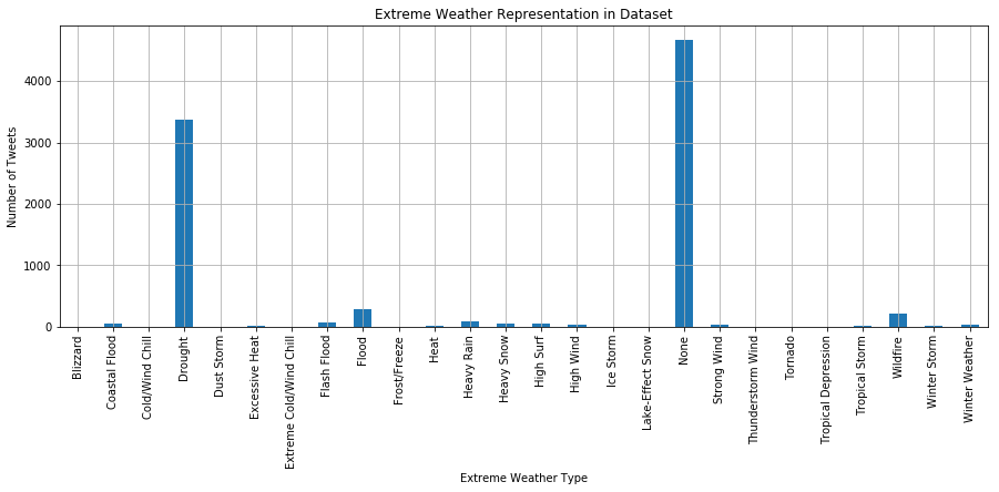
In the Dataset Most of Tweets are labeled "None" or "Drought"
In this dataset, we see that most of the tweets have no extreme weather. The second most popular extreme weather is a drought, followed by wildfire.
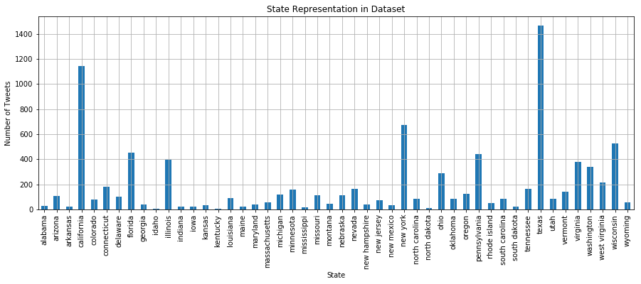
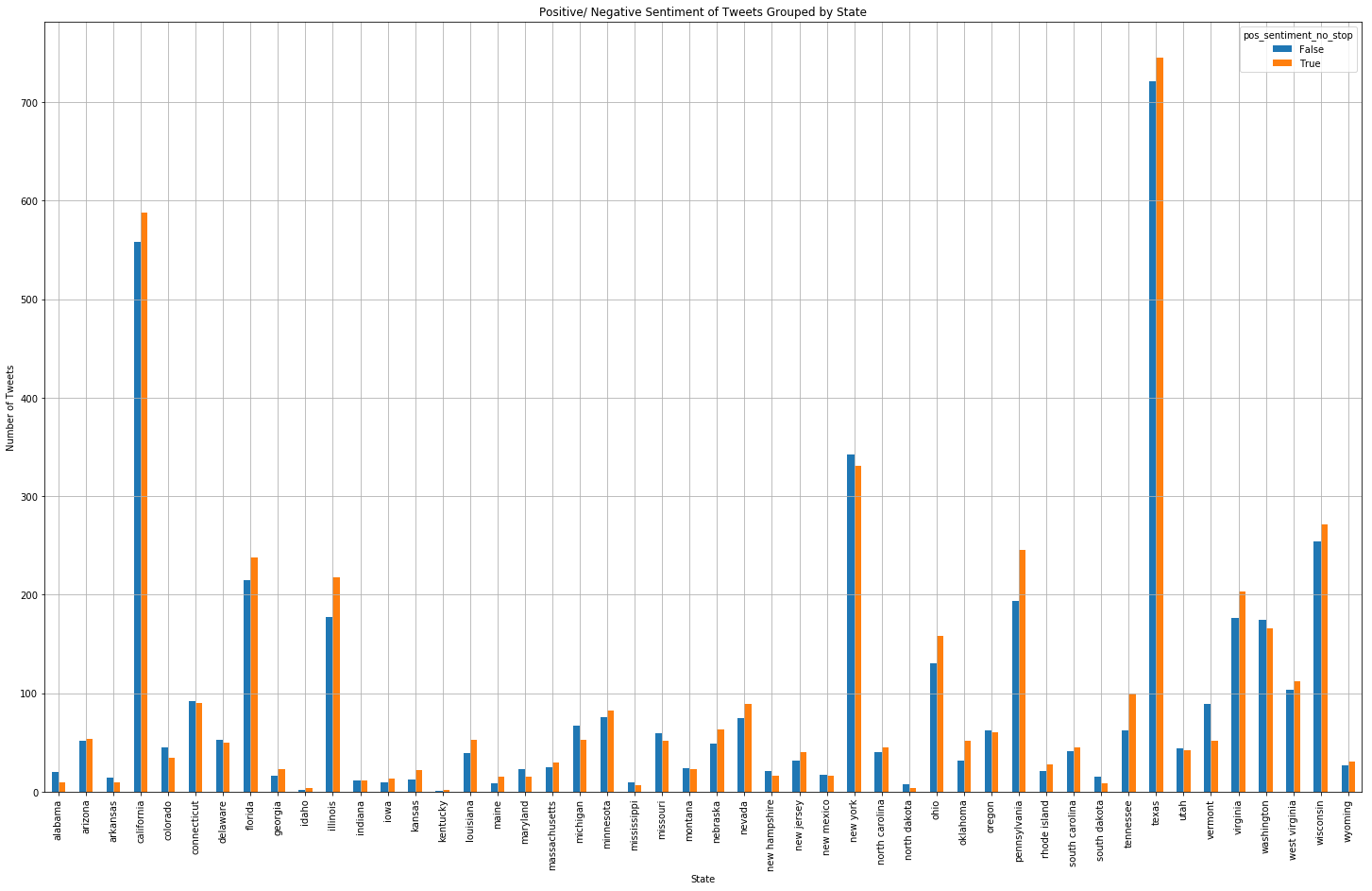
A Large Representation of Tweets from Texas, California, and New York
There is a large representation of tweets from Texas. California and New York come in second and third. They also have large populations. This is very interesting becaues in previous studies of this data set when I looked at small subsets of tweets (like 50,000) instead of just tweets that contain the word "weather", California was dispropotionally over represented and had a lot more than Texas.
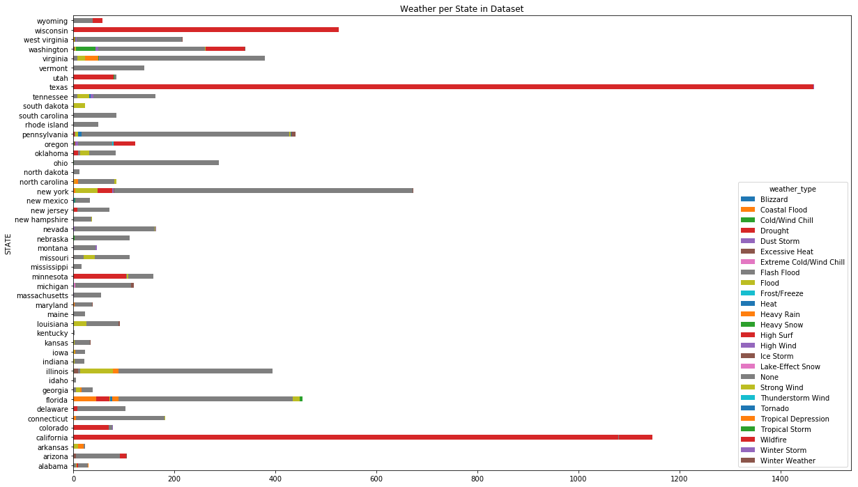
Grouped By State & Extreme Storms
This graph combines both of the information. We can see that the tweets from California were all during the drought for the most part as well as Texas and even Utah. A lot of the tweets divided by states are not during an extreme weather event. A problem with this graph is the limited color options that matplotlib uses
Tokenizing Text
A Hand-driven Approach
The main technique I will be using to test for the twitter sentiment is by using a dicionary of positive and negative words. This dictionary was created by Jeffrey Breen for twitter sentiment analysis.
From there I plan to sort tweets into positive and negative categories and further compare between the two.
Using a dictionary and counting the number of words for sentiment analysis suits this case because we are looking for things that hint at a sentiment. However, as a caution, some of the negative words in already have weather attached, such as rainy.
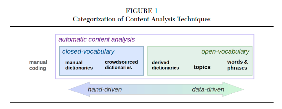
Image from Schwartz, H. Andrew et al. “Data-Driven Content Analysis of Social Media: A Systematic Overview of Automated Methods.”
Data Cleaning Challenges
Adjusting the Data Set and a Lack of Computational Power
To get the Twitter Corpus into a usable form to be matched with the Storm Events Database, I need the state and a time period. Not all of the self-reported twitter locations contain states and many of them only contain a city. In addition for some pieces that do contain the state name, it may be written as an abbreviation (CA) or in full (California). Again, due to the inconsistencies and lack of computational available on the machinery being used to complete this task, the user's city name is pulled and that is to be matched to its corresponding state (this is done by comparing the city to a spreadsheet that provides the state and city name). The problem with this method is that cities with the same name exist in different states and matching in this fashion can either produce the same user being repeated in the same set for each state (which would increase their influence because they would be overrepresented) or a user being matched into the wrong state. This issue can be solved by using longitude and latitude. Because the corpus separates the user/location from the tweets, this requires us to match all of the users to a state before we can rematch them to their tweets. The size of users is unfortunately more than my machine can handle which is why I have resorted to this method.
Tokenizing
Calculating the Positive/Negative Sentiment of a Tweet
This was done by tokenizing the tweets and counting for the amount of positive and negative words. The tweet was categorized as negative if the proportion of negative words was greater than negative.
| # | tweet | weather_type | pos_sentiment | pos_sentiment_no_stop |
|---|---|---|---|---|
| 0 | yes! Do you mean the good weather ea... | Drought | True | True |
| 1 | I know three things to be true: SF weather is ... | Drought | True | True |
| 2 | Colder weather is kind of exciting, except for... | Drought | True | True |
| 3 | Did anyone tell the weather it's november? | Drought | True | True |
| 4 | that's METARspeak for "nice weather" | Drought | True | True |
| 5 | Headed to Oakland soon, where the weather is K... | Drought | False | False |
Mostly Positive Tweets, But Difference isn't Too Big
True corresponds to positive sentiment. In general we see more positive tweets. The proportion of positive to negative aren't too drastic from one another.
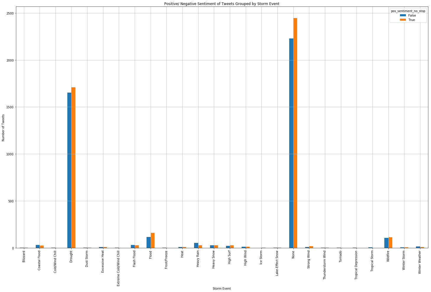
For drought and none we see that the same trend that we saw in the states remains. For the categories that have less than 100 tweets, we see that there are cases of more negative tweets. For the ones that have more negative than positive tweets we see heavy rain as having significantly more. Interestingly, heavy rain is one of the few that seems to fall under this trend and rain is one of the situations where we are most likely to feel sad because of the weather according to studies. Winter weather also has more negative tweets as well as high wind. High wind has more negative tweets but strong wind does not. Those tweets are small so we would have to look at those closely to really see what it's about.
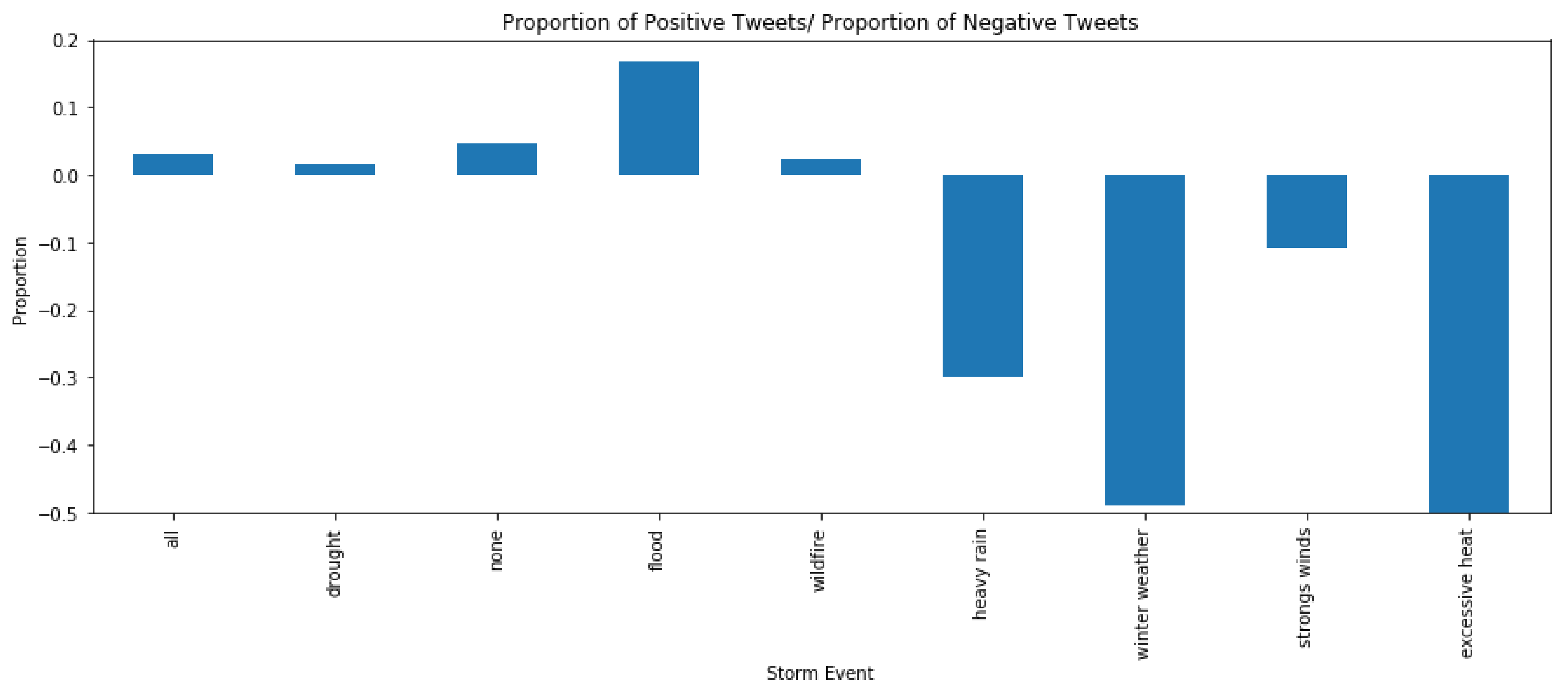
How many more positive than negative?
Right now we only have positive or negative (no neutral). To test what we see in the graphs, we will further check to see if in the per weather category if there are more positive tweets than negative tweets.
Using the below formula:
positive/#total - #negative/total
More Negative Tweets in Extreme Weather?
I chose a select few to take a look at. We can see in the "all", which looks at all of tweets that the difference between positive/negative isn't that large, but for more extreme weather such as heavy rain, winter weather, and excessive heat we see more negative tweets. It's interest to see that winter weather and extreme heat both have portionally more negative tweets despite being two temperatures. This supports the idea that extreme weather affects what people are tweeting about based only on these proportions.
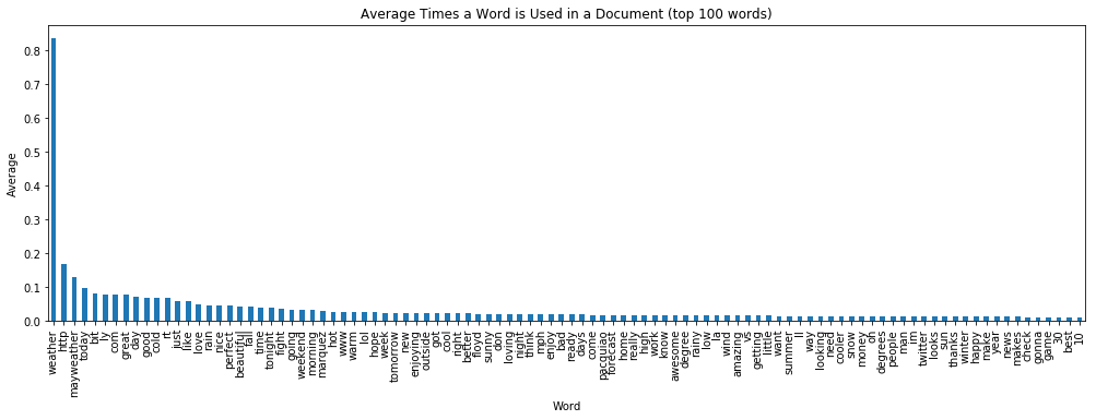
Document Term Matrix
Most Frequent Words
In addition, I did more explorations of the text using a DTM of the data set created using sci-kit learn.
Euclidean Distances to find out How Similar Weather-grouped Tweets
Distance between none and drought
1532.70675604
Distance between none and flood
4194.91632813
Distance between none and wildfire
4290.91528698
Distance between drought and wildfire
2842.30610596
Distance between drought and flood
2751.99509447
Distance between none and heavy rain
4401.52723495
Distance between none and winter storms
4449.65133466
Distance between none and high winds
4452.62169963
Distance between none and extreme heat
4461.77341424
Distance between winter storms and extreme heat
25.5538646784
Distance between extreme heat and drought
3014.70164361
Just testing a few of these for their euclidean distance, we can see that comparing the "none" tweets (tweets when there is no extreme weather) to these select extreme weathers, we see the greatest distance when looking at storm events that produce more simuli (rain,snow, wind, more heat) than drought. In addition, when we look at the distance between winter storms and extreme heat, it is very small even though the weather conditions are quite different. Looking at extreme heat and drought, which both suggest hot weather we still see a large difference.
From this, it further suggests that it is not really a matter of being cold, but that the weather is extreme or different from the norm.
Conclusions
Because of the messiness of this dataset, it's hard to draw any real conclusions of whether people are tweeting more positively about weather during specific storm events. Looking at the tweets more generally, shows us that there are generally more positive tweets when the word "weather" is mentioned. Based off of the grouping of sentiment, we see that the proportion of positive tweets to negative tweets is decreased in cases of extreme weather (graph is revisited below). This goes to show that it's most likely that extreme weather does in some ways cause people to write more about the weather negatively. However, we see that the total number of tweets about the weather during an extreme storm versus none isn't that much different which goes to say we probably see weather at a smaller and less global level. This is probably why drought tweets don't sound as drastic because it's hard to observe a drought than something like heavy rain.
When we look at the other graph of the words used throughout the document, we see that the most frequent words are positive and talk about good weather. In the Word2Vec, it drew out that the words most similar to weather are describing the time of the day (like the morning), but in looking more closely at hot and cold, hot is most similar with summer and fall and cold is with winter (as for seasons). This twitter set contains tweets from fall to winter so this makes sense. Cold has has 'hate' and 'crazy' while Hot has 'gloomy' as its second most similar word. But when you look at autumn (which has hot temperatures depening on where you live) you see that it gives off a mixed feeling as it's "gloomy, gorgeous, and beautiful."
Mixing datasets is a messy task because it's not clear if you're seeing real connections, but from these analyses we can see that there is some connection between extreme weather and negativity because when we dive the tweets into extreme weather versus the "none" we start to see more negativity and polarity. When we look at the tweets as a whole, we see that the top words are mostly positive which I did not expect, but rethinking about it, a lot of people tend to take notice of when the weather is good and tweet about when it's a perfect day to be outside. This is why we have a lot of positive tweets.
In general, people tend to tweet about things they feel have an effect on them.
Possible Further Analysis
If this analysis were to be done again, it would require better cleaning of the dataset (and more machine power). But in general, I think this research was good for exploring possibilities of when people might be prompted to talk start mentioning weather. I only looked for tweets that had the word weather, but it would have been better to use a dictionary that had terms used to describe the weather. In addition, using a weighted dictionary or a better sentiment analysis would make this analysis strong.
I hope that in the future, people will continue to use text analysis as a way to categorize and bring together different disciplines because it can add more dimensions to things we don't really think much about. The weather, it's always there and always changing, but it's hard to really consciously realize that it might be what's making you feel off. There are studies that say that yes extreme weather is doing this, but they always preempt people to talk about the weather, put people in isolated case studies and also how people feel about weather is also very subjective. Therefore, it's necessary to find a way, even if it's a little messy, that can analyse and allow us to look at what we have been doing and being able to separate ourself a little (which counting words does). But ulimtately, we have to re-insert our own opinions back to think if this makes sense and ultimately, these techniques are best for exploring.